top of page


Brief
Seaweed is a display typeface that was created specifically to fit the needs of WWIII, a graphic novel.
Project
Display typeface design in three varying weights
Inspirations
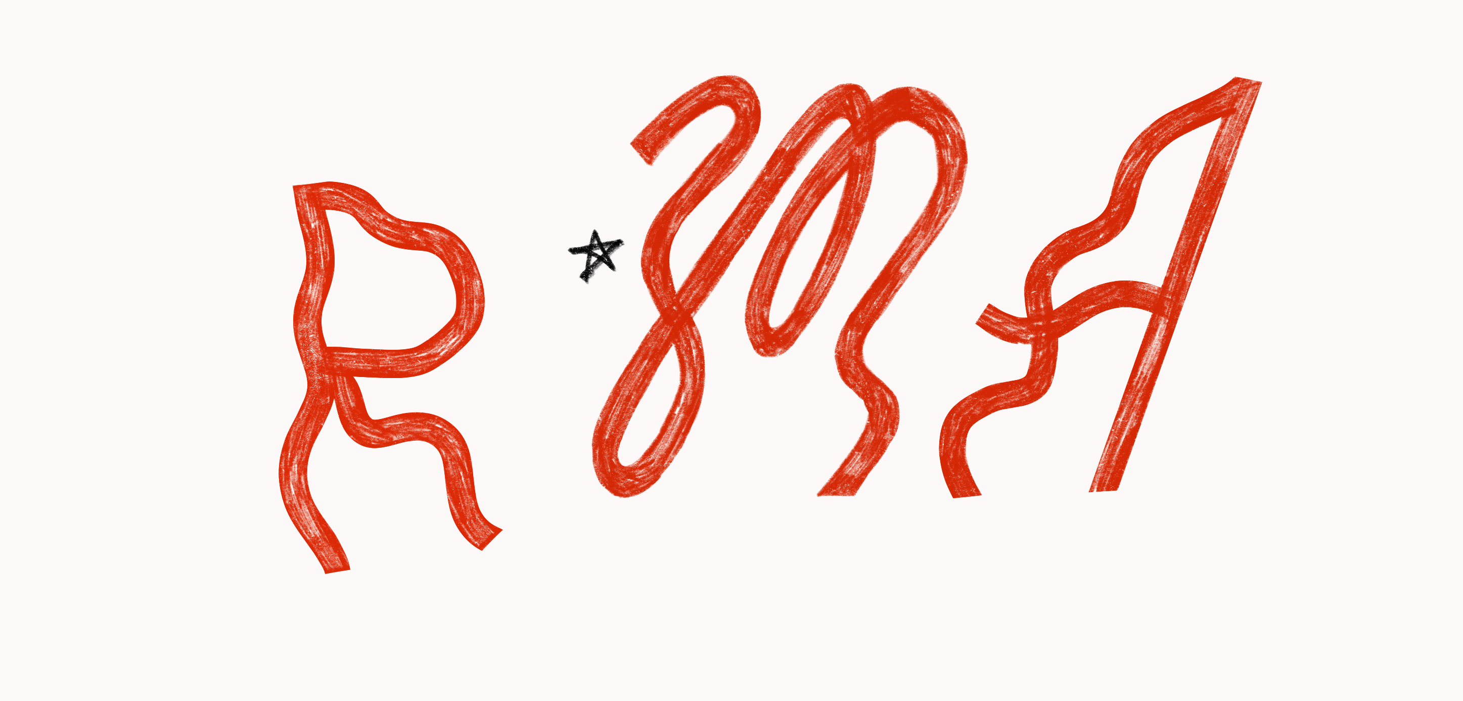
I was really intrigued by the shape of seaweed. The constant lull of the ocean never allows them to maintain their form for more than a second, it's always changing and that was really cool to me and I wanted to emulate that in my letterforms.
Scope
Typography
Type Design
Graphic Design
Illustration
Some early explorations of the letterforms

I started in the sketchbook drawing the letterforms of each letter, I almost filled a sketchbook with all the explorations.
The best letterforms from my sketches were chosen and then drawn on procreate digitally.
Display Typeface

✶ Available in three weights
✶ All Caps Typeface
✶ No contrast in stems
✶ Not meant for body text
1
Variants for most letterforms
Most letterforms have 2 or more variants to give that “humanist” look, inspired by Gutenberg’s Type in his Bible. When hand-lettered, it especially looks more organic.


2
Inclined verticals, not straight
No letterform’s stem is angled at 90 degrees, all of them are in their unique inclines, to give it a more seaweed-like look.

3
Wave-like
characteristics
Since it’s inspired by seaweed, Seaweed has letterforms that have that sense of motion, like they’re caught in a wave.
Most letterforms have multiple variants (as mentioned before) and they all have waves to
re-create that constantly-moving, dynamic
essence of seaweed in the ocean.
The typeface is alive because of that.


Seaweed Medium 72pt
Seaweed Medium 64pt
Seaweed Medium 56pt
Seaweed Medium 42pt
Seaweed Medium 36pt
Seaweed Medium 28pt

Seaweed Light 136pt
Seaweed Medium 136pt
Seaweed Black 136pt
Seaweed in action
The purpose of this typeface was to provide chapter headings for the book WWIII. These headings were hand-lettered though, the font was used as a stencil to provide constraints and cohesiveness to the headings.
The “S” of slow is slightly different in the hand-lettered version than in the actual font Seaweed Medium. That is because I didn’t want to stick to the forms I had created in the font but rather use them as a base to play with and to take liberty with. Consequently, “L”s are also different & so is the stem width of “I”


The typeface is available for commercial licensing. If you want the type files please reach out to me & click this link below:
bottom of page